
Over the last semester in Introduction to Graphic Design, I have learned a lot of things that will help me with my photography. I have also learned a lot about tools that can do multiple different things and it is very interesting how you can manipulate images to make them better, or alter them completely.
Next semester I would like to use Adobe Photoshop more extensively and learn how to remove blemishes, replace colors, and alter photographs efficiently. I would also like to get better at making deadlines.
Popular Posts
-
snapshot or photograph? Snapshot- a quick, spontaneous picture taken to record a moment in time. Photograph- an image taken with care and ...
-
How can you, as the designer, use principles of design to help compose a page? You can use different layouts and lines to organize the page ...
-
What kind of art/design does he produce? He uses clippings of real objects to make other objects. In what publications/media studios has h...
-
Over the last semester in Introduction to Graphic Design, I have learned a lot of things that will help me with my photography. I have also ...
-
 Painting of bison from Lascaux What are cave paintings? It was a way for prehistoric man to communicate and record events. Beautiful, det...
 -
The right use of color can do what? Maximize productivity, minimize visual fatigue, and relax the whole body. Within the electromagnetic s...
-
Within what art genre did Warhol work? Pop art Define the genre? includes imagery from popular culture such as advertising, news During...
-
 Week 11's assignment was probably my favorite that I have done in the class. I enjoyed incorporating my own photography int...
 -
What is OSHA? What do the letters stand for? Occupational Safety and Health Administration: OSHA makes sure that every ma and women has a...
Monday, December 19, 2011
Week 17 review
There are many types of serifs. Because of this, typefaces using serifs may not be as easy to classify. The serifs can be very abrupt or the can be large or log. It also shows us the origin of the word serif which can be traced back quite a ling tome to the Dutch.
review week 14
Academy of Art College in California
Amarillo College in Amarillo, Texas
Art Institute of Colorado in Denver Colorado
Art Institute of Atlanta in Atlanta, Georgia
Art Institute of Dallas in Dallas, Texas
What is a portfolio? A portfolio compiles all of the art and assignments that you have worked on in order to organize it and make it easily available for those who want to look at it.
What is the importance of a portfolio? It organizes the material that you have created so that possibly employers can see it.
review week 13
How do you add a layer mask to a particular layer? You select the layer on the layer palette and then you press the add layer mask
What two colors are used to create the mask? Black and white
Describe the process of using a layer mask? You add the layer mask and after it has been added, you paint the area black to erase the area around the mask, and white to bring it back.
What two colors are used to create the mask? Black and white
Describe the process of using a layer mask? You add the layer mask and after it has been added, you paint the area black to erase the area around the mask, and white to bring it back.
review week 12
How can you, as the designer, use principles of design to help compose a page? You can use different layouts and lines to organize the page and the design to make it more appealing to the target audience
What are the principles of design (define each in your own words)? The principles of design are how you decide to organize your design, what aspects you decide to include, and the way you present your design
What are the principles of design (define each in your own words)? The principles of design are how you decide to organize your design, what aspects you decide to include, and the way you present your design
Stephen Kroniger
What kind of art/design does he produce? He uses clippings of real objects to make other objects.
In what publications/media studios has his work been featured? Books, tv shows, and art galleries
Post 2 samples of his art. Answer the following questions for each piece...
Was this piece published? Where?
What principles of design were utilized within the piece? How?
What elements of design were utilized?


 Monochromatic
 Complimentary
 Split complimentary
Andy Warhol
Within what art genre did Warhol work? Pop art
Define the genre? includes imagery from popular culture such as advertising, news
During what years was he alive? August 6, 1928 – February 22, 1987
Post 2 samples of his art. Answer the following questions for each piece.
Title of the piece?
Describe the color that he utilizes. Does he use any particular color scheme?
What do you notice about the artwork itself?

1. Campbell's Soup
2.Monochromatic. He uses mostly hues of red
3. It is very simple, yet it appeals to the eye.
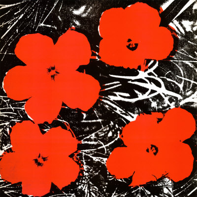
1. Flowers
2. Monochromatic- He uses red along with some neutral colors.
3. The art looks sloppy.
Review week 9
Compare and contrast vector graphics and pixel images. Vector images are continuous and do not usepixels so the image is not distorted when enlarged.
What resolution is necessary to print raster images? 300
What resolution is necessary to display raster images on the internet? 72
What resolution is necessary to print raster images? 300
What resolution is necessary to display raster images on the internet? 72
Review week 8
Why must designers pay close attention to how color is utilized within a composition? Because, depending on the colors used, the design might clash and be unappealing.
Why is the color wheel an important tool for graphic designers? It helps you know what colors will go well together and which ones will not.
Find an example of neutral colors utilized within a design (hint: google poster design). Near the sample, discuss why you feel the designer included neutral colors within the composition.
 The designer uses the neutral colors to draw attention to the brilliance of the red couch.
 Briefly describe how we "see" the color of an object? White light hits the object and the object reflects color back to our eyes and we see what ever is reflected.
Steve Jobs
Who is Steve Jobs? The CEO for Apple, that died recently
What company was he CEO for many years? Apple
What did he do for the computer industry? He revolutionized the computer industry by making computers more appealing and efficient.
How did this man impact the graphic design industry? The way his computers were advertised was very simple yet very appealing to the eye so many people wanted his product.
"Podcast #2 Color Theory"
The right use of color can do what? Maximize productivity, minimize visual fatigue, and relax the whole body.
Within the electromagnetic spectrum, which waves allow us to see color? Visible light
Describe white light? White light occurs when there is an equal part of all colors in the visible spectrum are present.
How do we see color if objects "have no color of their own"? Objects reflect certain spectrum of visible light/ color, and they absorb others.
What is a glass prism? A glass prism is a tool that can be used to split white light into the colors that make up the white light.
What seven colors result when white light is refracted through a prism? Red, orange,yellow,green,blue, indigo, and violet.
Describe hue? Hue is the intensity of a color
When does white light occur? when all light is reflected back to your eye.
When does black light occur? When no light is reflected to your eye.
How color is perceived depends on what? The light or environment that the object is perceived in.
What is a color wheel? The color wheel is a wheel of color that shows the relationships of the colors.
What are primary colors? Name them? Red, blue and yellow
What are secondary colors? Name them? Orange, green and violet
What are tertiary colors? Name them?
red orange, yellow orange, blue green, blue violet, red violet, and yellow green.
red orange, yellow orange, blue green, blue violet, red violet, and yellow green.
What are neutral colors? How can they be created? Colors that do not show up on the color wheel. The have low saturation.
How can a neutral color help a design? They help put focus on other colors.
What are complementary colors? Name them? red and green, orange and blue, yellow and violet.
What is color value? Lightness and darkness of the hue.
What is a shade? Color mixed with black
What is a tint? color mixed with white
What is saturation/intensity? hue
What happens when you mix complementary colors together? They become neutral colors.
Describe color harmony? When colors complement eachother and go together well.
What is a color scheme? A scheme use throughout a design to make the advertisement or design appealing to the eye.
Describe a monochromatic color scheme? uses one color
Describe an analogous color scheme? uses three colors that are side by side on the color wheel.
Describe a complementary color scheme? uses solely complementary colors in a design
Describe a split-complementary color scheme? one color then the two colors beside its compliment.
Describe a triadic color scheme? three colors that form a triangle on the color wheel
What colors are considered to be warm colors? colors between yellow and red
Describe a warm color scheme? analogous with red orange and yellow
What colors are considered to be cool colors? blue through yellow
Why is important to consider which colors are being used within a design?so that the colors do not clash and it is appealing to the eye.
Review week 6
What is the pen tool used for? The pen tool allows you to follow a line with a tool that makes a continuous line that can be manipulated through the use of handles.
How can you manipulate a path/line in Illustrator? Discuss the use of the white arrow tool, pen+, pen-, and convert too.
There are many ways to manipulate lines that are created with the arrow tool. You can use the white arrow tools to move the anchor points on the line. The pen + tool will add an anchor point while the pen - tool will get rid of an anchor point. The convert too will change the anchor points and the shape of the line.
There are many ways to manipulate lines that are created with the arrow tool. You can use the white arrow tools to move the anchor points on the line. The pen + tool will add an anchor point while the pen - tool will get rid of an anchor point. The convert too will change the anchor points and the shape of the line.
How can you utilize the layers palette in Illustrator? You can use the layers palette to edit an image and it will help keep the lines or shapes on their own layers so they can be deleted or edited without altering other object unintentionally.
How do you create a clipping mask in Adobe Illustrator? In illustrator, to make a clipping mask, you have to select an object then bring that object to the front. Once the object is in the front, you go to the object file at the top of the page and once it opens, select "create clipping mask".
Friday, December 2, 2011
Week 16 review
Of the seven classifications, which classification(s) would best work as body type? Why?
The seventh. It would put the least strain on the eyes when used close together with multiple words.
Identify the lowercase characters that have ascenders?
b,d,f,h,i,k,l, and t.
Identify the lowercase characters that have descenders?
j, p, q, and y.Classify the following typefaces and briefly explain why you believe it should be classified that way:
 Slab sefif. It has the thick square serifs.
 Script. The writing is in a fancy font, cursive.
 Decorative or ornamental. The text is three-dimensional
 San Serif. The text has no serif.
 Blackletter. It looks like old age calligraphy.
 Old style. It has wedge-shaped serifs.
 Slab serif. It has square serifs
The seventh. It would put the least strain on the eyes when used close together with multiple words.
Identify the lowercase characters that have ascenders?
b,d,f,h,i,k,l, and t.
Identify the lowercase characters that have descenders?
j, p, q, and y.Classify the following typefaces and briefly explain why you believe it should be classified that way:
Slab sefif. It has the thick square serifs.Script. The writing is in a fancy font, cursive.Decorative or ornamental. The text is three-dimensionalSan Serif. The text has no serif.Blackletter. It looks like old age calligraphy.Old style. It has wedge-shaped serifs.Slab serif. It has square serifs
Wednesday, November 30, 2011
Podcast #4 Typography
Define typography?
The art of expressing ideas through the selection of appropriate typefaces.
Where did the word "typography" originate from?
What does typography involve? Distinctive designs of visual symbols that are used to compose a printed image or design.
What is a typeface? A font
What is another term for typeface? Font
What is a character? individual characters that make up a typeface.
What is type style? Modifications in a typeface that create design variety while maintaining the visual style of the typeface
What does type style "create" within a design? It creates interest with variety while staying uniform.
What is the waist line and what does it indicate? Imaginary line through the middle of the characters.
What is a base line and what does it indicate? imaginary line at the bottom of a character.
What is an ascender? The part of a character that extends above the waist line
What is a descender? part of the character the extends below the base line
Describe a serif? smaller line used to finish off a main stroke or letter, usually at the top and bottom of a character.
How can the size of the typeface be identified? by it's point size
What is a point? The vertical measurement used to identify the size of a typeface. It measures from the top of the ascender to the bottom of the descender
How many points are in an inch? 72
What is a pica and how many are in an inch? 6
How many points are in a pica? 12
What is body type and where can it be found? Where there is a lot of text to be read.
What is the key to selecting appropriate typefaces to be used as body type? You have to choose the correct size typeface so it is appropriate for the message or the amount of text.
What is display type and how is it used? Type sizes above 12 pt. Typically these sizes are used to draw attention to a message
What is reverse type and when would it be used? consists of white type on a solid black or darker background. If the text is too small, reverse type can be difficult on the reader's eye. Display type is necessary.
What is a typeface classification? A basic system for classifying typefaces was devised in the 19th century when printers sought to identify a heritage for their own craft.
When was Blackletter invented and how was it used? Blackletter is the earliest of the typefaces. It was used with the invention of the printing press in the mid 1400's
Describer the characteristics of a Blackletter typeface? Blackletter typefaces resemble the calligraphy of the time and are highly ornamental with the elaborate thick to thin strokes.
When was Old Style invneted and what was is based on? Blackletter.
Describe the characteristics of an Old Style typeface? Typefaces in this classification have wedge shaped, angled serif and a low contrast of their thick/thin strokes.
When were formal scripts developed? The 17th and 18th century
When were casual scripts developed? 20th century
Describe the characteristics of a Script typeface? Based on forms made with flexible brushes or pens and have varied strokes reminiscent of handwriting.
When was Modern typefaces developed and why? late 18th and 19th centuries as a radical break from traditional typograpght of the time.
Describe the characteristics of a Modern typeface? Sharp contrast between thick and thin strokes and have thin, flat serifs
How early can Sans Serif typefaces be found? What happened? The 5th century, but the italian renaissance made it obsolete in the 20th century
When did they become popular? In the 1920s.
What does "sans serif" mean? Without serifs.
Describe the characteristics of a Sans Serif typeface? It's strokes are uniform in weight and have a monotone appearance.
When was Slab Serif developed and why? During the 19th century for advertising purposes.
Describe the characteristics of a Slab Serif typeface? It had a uniform line weight and thicker, square serifs
Describe Decorative typefaces? They are the most distinctive design style, and were developed with a specific purpose, or theme, in mind.
Why were they developed? For a specific purpose or theme
What are they best used for? Larger point sizes or display type.
Friday, October 21, 2011
Friday, September 2, 2011
What does it take to create good graphic design?
An understanding of the basic principles of graphic design.
What is the difference between elements and principles?
Elements are the actual things added to the design. Principles tell us how we should organize the elements on the screen.
Name the six (6) elements of design.
What is the difference between elements and principles?
Elements are the actual things added to the design. Principles tell us how we should organize the elements on the screen.
Name the six (6) elements of design.
Line-
Shape/form-
Space-
Texture-
Value-
Color-
What can lines aid in, when alone or combined with other lines or shapes?The readability appearance and message of a design.
Which lines suggest a feeling of rest? Why do you think?
Horizontal lines. The are at rest.
Vertical lines communicate a feeling of what? Why do you think?
Loftiness
What lines suggest a feeling of movement? Why do you think?
Diagonal lines/.
Soft, shallow curved lines suggest what? Why do you think?
Comfort, safety, relaxation
These lines suggest confusion and turbulence? Why do you think?
Curved.
What element defines a specific area of space?
What is the difference between two dimensional shapes and three dimensional shapes?
Describe the difference between geometric shapes and organic shapes?
What are abstract shapes?
Which basic shape projects an attitude of honesty or equality?
What do triangles suggest?
Circles convey feelings of what?
Describe positive space and negative space?
What is texture?
Incorporating texture into a design can help do what?
What is value?
What is another name for value?
What can the element of color do when incorporated into a design?
What is OSHA? What do the letters stand for? Occupational Safety and Health Administration: OSHA makes sure that every ma and women has a safe work environment.
How can graphic designers effectively communicate? In your own words, explain the communication process.
A graphic designer has to be creative, and they have to communicate to a very large group of people. They also need to break language barriers to get points across.
Understanding the history, culture and movements of fine and graphic arts will make you a better producer of visual messages. Why? You will know how to better communicate an idea while still depicting what the client wants. You will know what worked in graphic design, and also what didn't work, so you will be able to loosely base your projects around that so you do not fail.
Subscribe to:
Posts (Atom)